Monday 1 July 2024

Warp and Weft - a bit more about Jennie Moncur


I’ve just got back from looking at some of Jennie’s tapestries which are in an exhibition as part of Warwickshire Open Studios in Vitsoe, Leamington Spa.

(The above image, courtesy of Annabel Rainbow, is of Vitsoe showing the poppies that bloomed so madly the first year after the land outside, landscaped to represent old Warwickshire ridges and furrows - were laid to wildflower seed)

Jennie works with Vitsoe as creative director and among many things, also designs railway bridges: she showed us her book of bridge designs and there are at least 24 dotted around the country! She’s also designed the floors in the Vitsoe shops, so is a busy person and you might wonder when she has time to do anything else. But like all creative people she needs time to think and do her own thing.

Tapestry could never be called quick, growing very slowly as the threads are woven by hand, thin little rows at a time. The coloured yarns are the weft and they are woven in and out of the warp threads which are plain and attached to the loom (they are not seen once the weaving is complete). Her pre-dyed yarn comes mainly from Norway and Sweden.

Tapestries are woven on their side with a cartoon (a design on paper drawn out) attached behind with a basting stitch which stops the design slipping as the tapestry progresses. Jennie achieves subtle shading by gradually weaving lines of another colour through the main one, building gradually, and from a distance these lines blur and disappear.

In this photo, you can see Jennie weaving her weft threads through the warp threads, with the cartoon just behind and the basting stitches holding the design in place.

She uses plant references in stylized form not graphic, and her colours are vibrant and exciting, and the shading she achieves makes her work seem 3D. I thoroughly enjoyed talking to Jennie this morning, seeing her tapestries and finding out how a tapestry is made. Sadly, today is her last day exhibiting with Warwickshire Open Studios, but don’t forget she’ll be joining us at Leamington Jan/May 2025 when you can see her work and talk to her to find out more.


Friday 24 May 2024

Building for the exhibition


Above is another photo that Daniel Lismore has shared with us. He will be building a site specific piece in the gallery during December whilst he’s visiting Leamington. I’m sure being so last minute is a little unnerving for the gallery staff organizing the hanging etc but I’m certain it will be fine and there’s not really a better way of dealing with such amazing works!

In other news, the exhibition title has been finalized:

Unravelling History. Unpicking The Collections and Reworking Textile Traditions.

I must admit, we spent a considerable amount of time deliberating over it, wanting it to not only capture the essence of the artwork but also highlight its connection to the gallery’s collections. The tag line bit above is courtesy of Laura Kemshall who is always a whizz at such things! Certainly, all the new work being produced is done as a direct response to the pieces from the collections in the gallery or with commonalitites of subject matter or technique.

In the exhibition, the combination of new and old works will demonstrate how enduring themes have consistently resonated with textile artists and makers throughout history. These include visual inspirations like flowers and decorative techniques, as well as personal narratives and broader political themes such as protest and community building.

The exhibition will also showcase the gallery’s textile collection, featuring rarely-seen artifacts like Caribbean quilts, paintings, botanical books, toys, and fossils. It will also introduce audiences to donations from Amy Mary Spenlove Brown ( who donated a series of her own watercolours, as well as wide range of domestic items including a parasol, boot hooks and embroidery samplers) and Miss Cox, emphasizing the sense of heritage and value that family heirlooms carry.

1 of the 3 Caribbean quilts in the LSAG collection.
Miss Cox

There’s lots to think about when putting together an exhibition from initially discussing an idea with curators, and then completing formal exhibition proposal forms, explaining to interested parties how the exhibition would work and be of value to the community and be accessible to a wide range of audiences, not just the target audience. Practical planning has to be done once the agreement to proceed has been given, and fellow artists invited to take part, meetings arranged, archives and stores visited to search for for inspirational artefacts, new work planned and made, marketing thought about - logos, colours (we’ve chosen Eating Room Red - a deep red - and Dimity - cream), catalogue layouts, delivery of pieces, workshops, talks, QR codes, hanging, even the lettering on the walls has to be carefully considered - eg did you know that we see best with an 80% contrast? (These last few things are called “interpretive strategy”). 

Do come along in January and see the results!


Thursday 11 April 2024

Daniel Lismore update


“I live my life as an artwork” sometimes I use textiles as a form or armour, the fabrics are great canvases for many of my ideas”

 
Join us in Jan 2025 at Leamington Spa Art Gallery to see a unique piece made by Daniel for exhibition with Through Our Hands. @daniellismore
 

Wednesday 27 March 2024

Talking Heads - The Harmony of Difference 1

On the board this morning, ready for layering up and a lot of stitching before I start the painting bit, is this first piece in the new series.

I think the stencilling at the bottom provides a lovely 60’s vibe which I wasn’t expecting - I put it on to make the stitching easier and was going to “frost” it afterwards with some white acrylic paint, but now I’ll just wait and see what it needs.

What are these pieces about?

Here’s an extract from an earlier post on https://annabelrainbow.substack.com

You may already know that I’m working on a very old piece called Talking Heads, inspired by a visit to an art gallery many years ago, and some roughed out ideas in a sketchbook. Below is an image of the first effort at Talking Heads that has long since hit the bin!

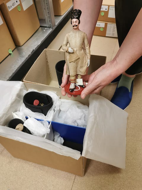
I have moved on slightly in the last few days as the new piece has come together, and it struck me that it ties in well with the other quilts I’m making for Leamington Spa Art Gallery and Museum, about the Windrush generation. My starting point as far as the upcoming exhibition is concerned, was the collection of wooden dolls stored in a box in the gallery’s vaults. I don’t think the gallery were sure what they were for, but they’re Indian, and probably advertising or marketing tools of some kind, and were donated.

It made me think not only of shape and colour of them, but also that there is a profound beauty found in the diversity of humanity they represent, and I hope these colourful abstract people I’m making for these new quilts will reflect that diversity in some way.

My new working title for the pieces is The Harmony Of Difference.

You can see from the scrappy piece of paper pinned on the board, that I’m not a great planner, relying on the old synapses firing from time to time to take me forward with an idea. I was just sitting in the studio thinking about how colourful and how different people can be and the connection was made.

So, my hope is that each of the abstracted figures on the quilts will represent a unique expression of identity, embodying this rich human diversity, but I have a long way to go and much research to do! Words and art are an important and a powerful way of confronting prejudice head-on and as a stitcher of words I feel this is a tool I should use. I’m not a wonderful artist tbh, just someone interested in using art to evoke an emotional response of some kind, and one of the many things I get concerned about is the unjust prejudice from race, ethnicity, gender, sexuality, religion, disability, class and age and want to tackle these biases in my own small way, perhaps using my quilts (there will be at least 2) to try to highlight my thoughts and perhaps move towards a more inclusive and equitable world by celebrating the values that unite us as human beings, in the public arena of an exhibition.

The way we see ourselves and our sense of social identity shape our interactions, and sometimes it helps to step back and look at differences again.


Wednesday 13 March 2024

Dyeing


Dyeing fabric

I love the serendipidy of dyeing your own fabric to create original colours and textures.


The possibilities are endless when it comes to dyeing fabric and what a fascinating way to make something really original for your textile art work. I’ve been giving it a go and wanted to share the results.

Help is at hand

If you’re a complete beginner, one of the Through Our Hands crew, Laura Kemshall, is writing a book on Substack about the process and it’s got all the recipes and step by step instructions if you need them. Even though I’ve done it lots of times, a reminder was timely! (Laura’s Dye Like An Artist is here) I’m not really experienced enough to give you a complete lowdown including all the health and safety stuff, she’s much better at that - I just like the doing and the huge stash of lovely colours and completely original fabrics I get at the end of a session! Please don’t just dive in there, do check the method and safety requirements somewhere first. Here’s the UK Health and Safety Executive website with some info. Obviously it refers to large scale operations in factories etc, but it’s a start.

Don’t eat the dye. Wear a mask. It’s messy, so cover tables in plastic sheets.

Here’s a photo of my set up with some of the ingredients you need. That piece of cotton cloth at the back is really gorgeous quality but cost £9 a metre! A huge amount I thought but it’s quite soft. You can buy cheaper and I usually go to Whaleys. Try and get “prepared for dyeing” which means there’s no dressings on the fabric - a usual part of manufacture - so you can go straight in and dye it without having to wash it first. Always a bonus - I’m quite lazy. I use procion dyes which are fibre-reactive and give really bright and intense colours. I have a feeling that the dye powder is something you don’t want to be inhaling so you’ll need a mask too. All these things are widely available including in that HUGE online store, Amazon.

You can of course dye fabric using all sorts of things like onions, flowers, wode, etc but it’s quite difficult to replicate colours over meterage, and you need different maudants for different cloths and flowers, so it’s not for me. (Aluminium lactate or aluminium acetate, alum & tannin, and titanium oxalate) There’s lots of info out there if you prefer that idea). It’s a look.

So, my lovely fabric didn’t need to be washed but I did dampen it a little because it scrunches up better, and I was going for a low water immersion method in a cat litter tray. It’s the scrunchiness that makes the marks on the fabric, so if you want a more even colour on your fabric, you need to not scrunch and give the fabric a large bath of dye so that it can swim around and fix evenly all over.

For the low immersion method, you just add a soda solution (with urea if you’re going for a dark colour - it helps the fabric absorb the dye) to your cloth, and then pour over the dye solution (dye mixed with water) to suit your own tastes, and then leave alone for a couple of hours. You can then rinse it and wash it, and that’s it. Don’t forget to give it a good fondling and admire it, and sigh over it!!

Below is fabric drying in the studio, and below that, my favourite piece which will be the base of the next quilt, Talking Heads. Can’t wait to start. 


Friday 1 March 2024

Rachel Thomas by Annabel

 Building a collection of quilts based on local Windrush experiences.

Windrush. Fading away with memories that will be lost. It’s a history we should record. This is a blog of how my pieces are building.

The series so far:

1) Rachel  – Most Racist Was In White Church  2) Marcia – Validation  3)  The Background’s Too Strong, it Needs to be Whiter 4) Jeff Brown – You Try To Do Your Best  5) George Saunders

A narrative of resilience, courage, and perseverance.


Threads of Memory – Windrush portrait #1, Rachel Thomas. “Most Racist Was In White Church”.